Full-height app layouts: A CSS trick to make it easier
In HTML layouts, there’s a fundamental difference between width and height. The natural state of affairs is that your page’s width is constrained to the width of the browser window, but its height is unconstrained – it grows however tall is necessary to contain its contents.
That makes sense for documents, but it’s a pain for application UIs. Native application UIs tend to slice up the screen both horizontally and vertically into a nested set of panels, some of which may scroll/resize, others being docked against particular edges of their parent panes.
So, what’s the robust way, with HTML/CSS, to set up a nested collection of panes that exactly divide both the width and height of the browser window?
Hang on, didn’t we have this one solved back in 1999?
Hmm… this reminds me of something… I remember: the **
- What you’re building is logically one page, but technically each frame is a separate HTML document, which makes interactions between them so much more complex
- It’s not really practical to support deep-linking to (i.e., bookmarking) particular UI states
- Mobile devices and tablets have very limited support for HTML 4 frames. iOS in particular requires the user to use two-fingered scrolling within panes. This is UX death.
OK, so what’s the 21st century solution?
I’ve used lots of hacks and tricks over the years to get columns and panes into my web applications, often involving JavaScript, $(…).height(…), window.body.clientHeight, and the onresize event. Ugh. Fragile and messy. But at long last this week I learned there is actually an elegant and robust way to set up nested exact-height panes with pure CSS, and it works on all browsers back to IE 7, even on current mobile browsers that *don’t *support position:fixed.
You know that if you set position: absolute on an element, then you can make it appear at a specified distance from the top, left, right, or bottom from its parent element. Well, it turns out that you can specify both top **and **bottom, or both left and right, and then it will dock against both edges and always resize to match its parent’s dimensions.
Let’s define some generic CSS rules for panes:
/* Generic pane rules */
body { margin:  }
.row, .col { overflow: hidden; position: absolute; }
.row { left: ; right: ; }
.col { top: ; bottom: ; }
.scroll-x { overflow-x: auto; }
.scroll-y { overflow-y: auto; }
Now it’s easy to set up a fixed-height header, variable-height body, and fixed-height footer:
<body>
    <div class="header row">
        <h2>My header</h2>
    </div>

    <div class="body row scroll-y">
        The body
    </div>

    <div class="footer row">
        My footer
    </div>
</body>
Of course, you also have to configure the heights and positions of the three rows by using a bit more CSS:
.header.row { height: 75px; top: ; }
.body.row { top: 75px; bottom: 50px; }
.footer.row { height: 50px; bottom: ; }
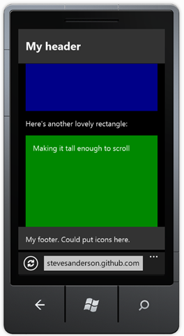
The result? It’s the classic mobile phone app layout. Screenshot with some colours and content added for interest:
Try it in your desktop or mobile browser here. Works on IE7+.
More nesting (or, tablet-style layouts)
The reason for setting up the generic CSS rules in that way is that it makes it easy nest panes arbitrarily. For example, you could split the main viewport into two vertical columns:
<body>
    <div class="left col">
        Left col here
    </div>
    <div class="right col">
        Right col here
    </div>
</body>
… and then subdivide the right column so it has a fixed header, variable-height body, and fixed footer, just by putting some more row divs inside it:
<div class="right col">
    <div class="header row">
        View or edit something
    </div>
    <div class="body row scroll-y">
        Here’s some content that can scroll vertically
    </div>
    <div class="footer row">
        Some status message here
    </div>
</div>
Here’s the CSS to configure the widths/heights/positions of those panes:
.left.col { width: 250px; }
.right.col { left: 250px; right: ; }
.header.row { height: 75px; line-height: 75px; }
.body.row { top: 75px; bottom: 50px; }
.footer.row { height: 50px; bottom: ; line-height: 50px; }
Going further, in the right-hand pane’s body, you could also nest a horizontally-scrollable row:
<div class="body row scroll-y">
    <p>Here's a horizontally-scrollable thing:</p>

    <div class="scroll-x">
        Any content in here, if it's too wide, becomes independently scrollable
    </div>

    <p>That's enough - bye.</p>
</div>
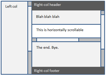
The result of all this? Well, it’s a structure like this:
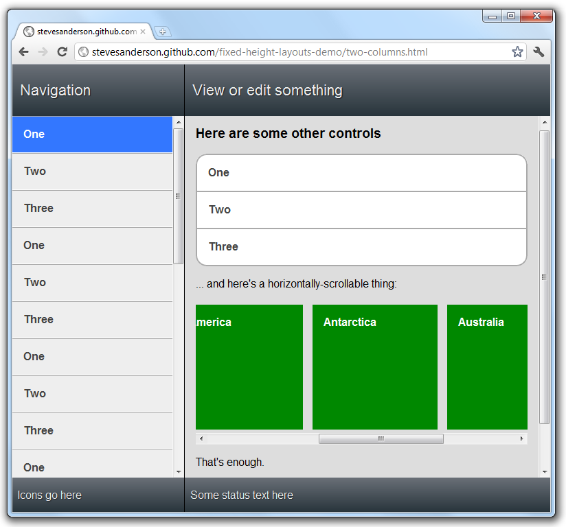
… but that’s pretty boring to look at, so here’s a version where I threw in a rough effort of some iPad-like styling:
Here’s a live example. It still renders correctly on very small screens (like a WP7 or iPhone) but this 2-column layout really needs a wider screen to be usable.
Enabling touch scrolling
The scrolling looks and works fine on a desktop browser, but on a mobile browser it varies:
- On WP7, you’ll see no scrollbars, but you’ll get one-finger touch scrolling, without the lovely inertia/momentum effect. This is kind-of OK, though imperfect.
- On iOS, you’ll see no scrollbars, and it requires two-finger scrolling (which is horrible), and it won’t use the inertia/momentum effect either. Badness.
- There are similar problems on Android
With iOS 5, it will be possible to enable fluid, native touch-based momentum scrolling to our divs just by making a tiny tweak to the CSS, thanks to the new “touch scrolling” feature:
.scroll-x, .scroll-y { -webkit-overflow-scrolling: touch; }
I really hope this catches on and becomes a standard.
But in the meantime, for visitors on other mobile OSes, and until iOS 5 becomes prevalent, you can use the open-source iScroll library that provides one-finger momentum scrolling for Webkit (iOS and Android) and Mozilla browsers.
Enabling momentum scrolling on any given element requires only one line of JavaScript (assuming you’ve referenced iScroll.js):
new iScroll(theElementYouWantToEnableItFor);
For my example, I used the following block of JavaScript, which enables touch scrolling on all the .scroll-x and .scroll-y elements:
<!-- Touch scrolling -->
<!--[if !IE]><!-->
<script src="script/iscroll.js" type="text/javascript"></script>
<script type="text/javascript">
    var xScrollers = document.getElementsByClassName("scroll-x");
    for (var i = 0; i < xScrollers.length; i++)
        new iScroll(xScrollers[i], { vScroll: false });

    var yScrollers = document.getElementsByClassName("scroll-y");
    for (var i = 0; i < yScrollers.length; i++)
        new iScroll(yScrollers[i], { hScroll: false });
</script>
<!--<![endif]-->
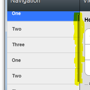
You could do this in fewer lines if you’re using a library like jQuery or XUI (which is a tiny implementation of a small part of the jQuery API surface, intended for mobiles). Here’s the resulting mobile-style scrollbar:
Of course, to see the momentum effect, you’ll need to run it in your Chrome/Safari/Firefox browser.
Credits: Thanks to Rob Swan and FellowshipTech for their articles and projects where I found the CSS positioning trick that underlies this approach to exact-height layout.
